Flexible Times: A Retro Display Font Built for Bold Digital Branding
I was deep in the middle of a homepage redesign for a client when I hit the usual wall. The hero section needed a headline that stopped people mid-scroll. Something with personality. Something that felt both nostalgic and fresh. I had tested a dozen display fonts that afternoon, and none of them landed. Either they were too ornamental to read on mobile, or they lacked the warmth the brand needed. Then I opened Flexible Times for the first time, dropped it into the mockup, and everything clicked.
This is the story of how Flexible Times became my go-to display font for that project, and why I think it deserves a serious look from any web designer, UI designer, or digital creator building a memorable online presence.
What Flexible Times Actually Looks Like on Screen
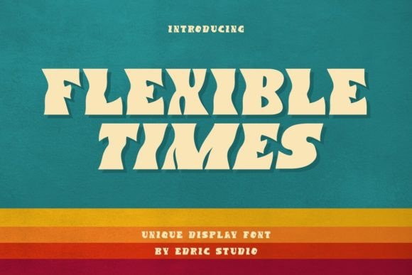
Flexible Times is a retro display font with a bold waves appearance. The name is accurate. The letterforms carry a deliberate, undulating rhythm that feels lifted from a mid-century storefront or a vintage album cover, but the execution is clean enough for modern layouts. The font comes in two styles: Regular and Italic. Both versions carry that signature wave energy, but the Italic adds a dynamic forward lean that works especially well for taglines, pull quotes, or accent words inside a heading.
When I first tested it in the hero section, I set the wordmark in Flexible Times Regular at around 72 pixels. The bold wave structure gave the headline a physical presence. It felt like the letters were carved rather than typed. The Italic version, placed underneath as a subtitle, added a nice contrast without competing for attention. The two styles work together naturally, which is rare for a display font that only ships with a couple of weights.
Where Flexible Times Belongs in a Web Layout
After building out several pages with Flexible Times, I found it performs best in specific roles. This is not a body copy font, and it is not trying to be. It is a display typeface designed for moments where you need to grab attention and hold it. Here is where it shines in real digital projects.
Hero Headlines and Landing Page Titles
This is the natural home for Flexible Times. The bold wave structure creates immediate visual hierarchy. In the boutique online store project I was working on, the hero headline read like a statement. The font gave the brand a handcrafted, confident feel that a standard sans serif could not deliver. The Italic style worked well for the supporting line underneath, adding motion without clutter.
Section Headings and Campaign Banners
I also used Flexible Times for section headings on the same site. The brand had a story-driven about page, and the font helped separate narrative blocks with a distinct visual voice. On a promotional campaign banner, the Regular style in all caps created a bold, poster-like effect that translated well from desktop to tablet.
Logo Text and Brand Accents
Flexible Times has a natural logo quality. The wave rhythm gives wordmarks a built-in identity. I tested it as a standalone logo treatment for a small coaching website, and it worked without needing additional ornamentation. The font carries enough personality to stand alone as a brand signature, especially when paired with a simple sans serif for the rest of the site.
Short Phrases and Call-to-Action Labels
One surprise was how well Flexible Times performed in short, action-oriented contexts. A bold display font can sometimes feel overwhelming in a button, but the wave structure here is balanced enough to work for a single word or a short phrase. I used it for a limited-time sale banner, and the retro energy made the offer feel urgent without being aggressive.
Readability and Scanning Behavior in Real Use
Every web designer knows the tension between a beautiful display font and actual readability. Flexible Times walks that line well. The bold weight ensures strong contrast against most backgrounds, and the wave shapes are consistent enough that the eye does not stumble. I tested it on a dark background with white text, and on a light background with a deep navy. Both setups were legible, though the dark background really made the wave structure pop.
For mobile screens, I recommend keeping Flexible Times to headlines and larger section titles. Below 24 pixels, the wave detail starts to compress, and the personality of the font gets lost. On a phone, I used it for the main hero headline at around 40 pixels and let a clean sans serif handle the body copy. The hierarchy was clear, and the font retained its character even on a smaller viewport.
Scanning behavior is another consideration. Display fonts with strong shapes can slow the reader down, which is exactly what you want for a headline. Flexible Times encourages the eye to pause and take in the message. For a brand that wants to be remembered, that deliberate pace is a feature, not a bug.
Font Pairing for a Polished Digital Identity
Flexible Times is a decorative display font, so pairing it with a restrained counterpart is essential. In my project, I used a clean, geometric sans serif for body copy, navigation, and secondary text. The contrast between the bold wave structure of Flexible Times and the neutral simplicity of the sans serif created a balanced visual system. The sans serif handled readability and information density, while Flexible Times brought the personality.
I also tested pairing Flexible Times with a serif font for the body copy, which gave the site a more editorial, magazine-like feel. That combination worked well for a blog header and a course sales page, where the brand wanted to communicate depth and authority. The key is to let Flexible Times lead the visual identity and keep the supporting typeface simple. Too many competing voices will dilute the impact.
If you are building a digital brand kit, Flexible Times can serve as the anchor typeface for logos, hero sections, and campaign materials. Then bring in a versatile sans serif for everything else. That pairing strategy keeps the design cohesive without overwhelming the user.
What to Check Before Using Flexible Times in a Project
Before you commit to any font in a real web project, there are a few practical checks worth making. With Flexible Times, I looked at the included styles and confirmed that both Regular and Italic were present. For a display font, two styles is often enough, but make sure the Italic version matches your needs for subtitles or accent text.
Webfont availability is another factor. Flexible Times is available in standard file formats, and I tested it in a local mockup before moving to the live environment. The font rendered consistently across Chrome, Safari, and Firefox on both desktop and mobile. No unexpected shifts or rendering issues came up.
Commercial licensing is always worth verifying before using a font on a client site, an online store, or a digital product. Flexible Times is a premium font, and the license terms should match your use case. If you are building a brand kit for a client or using the font in a template you plan to sell, confirm that the license covers commercial distribution.
Multilingual support is another consideration if your project targets an international audience. I tested Flexible Times with a few common accented characters, and it handled them gracefully. But if your content includes less common glyphs, it is worth checking the full character set before committing.
Real Projects Where Flexible Times Fits Naturally
Based on my experience with this font, I can see it working well in several real contexts. A boutique online store selling handcrafted goods can use Flexible Times to reinforce a handmade, authentic brand voice. A coaching website or course sales page can use the font to create a warm, approachable hero section that feels personal rather than corporate. A creative portfolio site can use the Italic style for project titles and the Regular style for the main name, building a cohesive visual identity.
Campaign landing pages, especially those with a retro or nostalgic angle, are another natural fit. The bold wave structure of Flexible Times gives promotional content a physical, almost tactile quality that standard web fonts struggle to match. For bloggers and content creators, using Flexible Times for post titles and section headers can add a layer of polish without requiring a full brand redesign.
Even in digital ads and social media graphics, Flexible Times holds up well. The bold shapes work at smaller sizes in feed layouts, and the Italic version adds motion to static text. If you are building a consistent visual identity across a website, email templates, and social assets, having a distinctive display font like Flexible Times in your toolkit helps tie everything together.
Why Flexible Times Deserves a Place in Your Font Library
Choosing a display font for a web project is never just about aesthetics. It is about how the font behaves in a layout, how it reads across devices, and how it shapes the way people perceive a brand. Flexible Times delivers on all those fronts. The retro wave structure is distinctive without being gimmicky, the two included styles give you enough flexibility for most display needs, and the font pairs well with a wide range of supporting typefaces.
In my project, Flexible Times turned a generic hero section into a memorable brand moment. The client noticed the difference. Users lingered longer on the page. The font did its job without calling attention to itself. That is the mark of a well-chosen display typeface.
If you are a web designer, UI designer, or digital creator looking for a display font that brings personality, warmth, and structure to your layouts, Flexible Times is worth testing. Drop it into a mockup, pair it with a clean sans serif, and see how it changes the feel of your next project. Sometimes the right font is the one that makes everything else fall into place.